Todo App with Chico UI
A small historical demo that taught me enduring lessons about UI libraries, scope, and product focus.
Back in 2012 there was a common way to test a UI library: build a Todo app.
I did exactly that with Chico UI, partly as an experiment and partly because I wanted to understand where a widget library helps, and where it gets in the way.
The demo is still documented in GitHub.
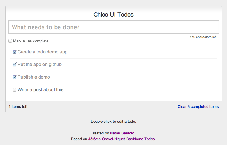
One important point that was true then and is still true now: a UI toolkit is not the same thing as app architecture.
Frameworks such as Backbone and Spine tried to structure data flow and state. Chico UI was focused on interaction widgets and visual behavior.
That distinction matters. Teams move faster when they know which tool solves which problem.
What this tiny project taught me
1) Demos are about learning speed, not perfection
A small app lets you evaluate APIs quickly:
- how predictable are components?
- how much custom CSS is needed?
- how easy is keyboard/accessibility support?
- what breaks under real user flows?
2) Scope discipline beats feature volume
The app stayed intentionally small, which made tradeoffs visible early.
When teams overbuild demos, they hide design and API problems under complexity.
3) Reusable UI still needs product thinking
Widgets help you ship faster, but they do not answer product questions:
- what should happen on empty states?
- what deserves focus in the interaction flow?
- which friction is acceptable?
Those are design decisions, not component decisions.
Some of the features I used
- List Class
- Blink Widget
- Countdown Widget
- Keyboard Events
- CSS Library
If I rebuilt this today
I would keep the same spirit but add:
- robust accessibility checks
- state and persistence tests
- clearer component contracts
- performance budgets from day one
The tools have changed. The lesson has not: build small, learn fast, then scale intentionally.